Asymmetric Typography is the absence or abandon of the use of symmetrical structures in printing and designing. A radical set forth a concept that:"The purpose of the the new typograpgy is functionality."
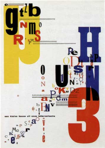
In 1931, one of the Piet Zwart's asymmetric typographic exercises for the trio printing company in the The Hague. The random overprinting of modern and vintage letterforms prefirgures the deconstructive apporaches of the later decades.
In 1927, a film poster designed by Jan Tschichold for the Phoebus Palast, embodies all the geometrical characteristics of the New Typography of the 1920's.

No comments:
Post a Comment